Responsive Design
Experiment with the responsive design
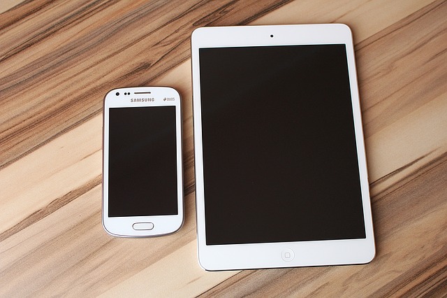
Responsive design allows your learning environment to work well on whatever device, computer, tablet, or mobile phone, that your learners are using to access the site.
Resize your browser or view on a tablet or mobile device to see the responsiveness of the Flip Book:
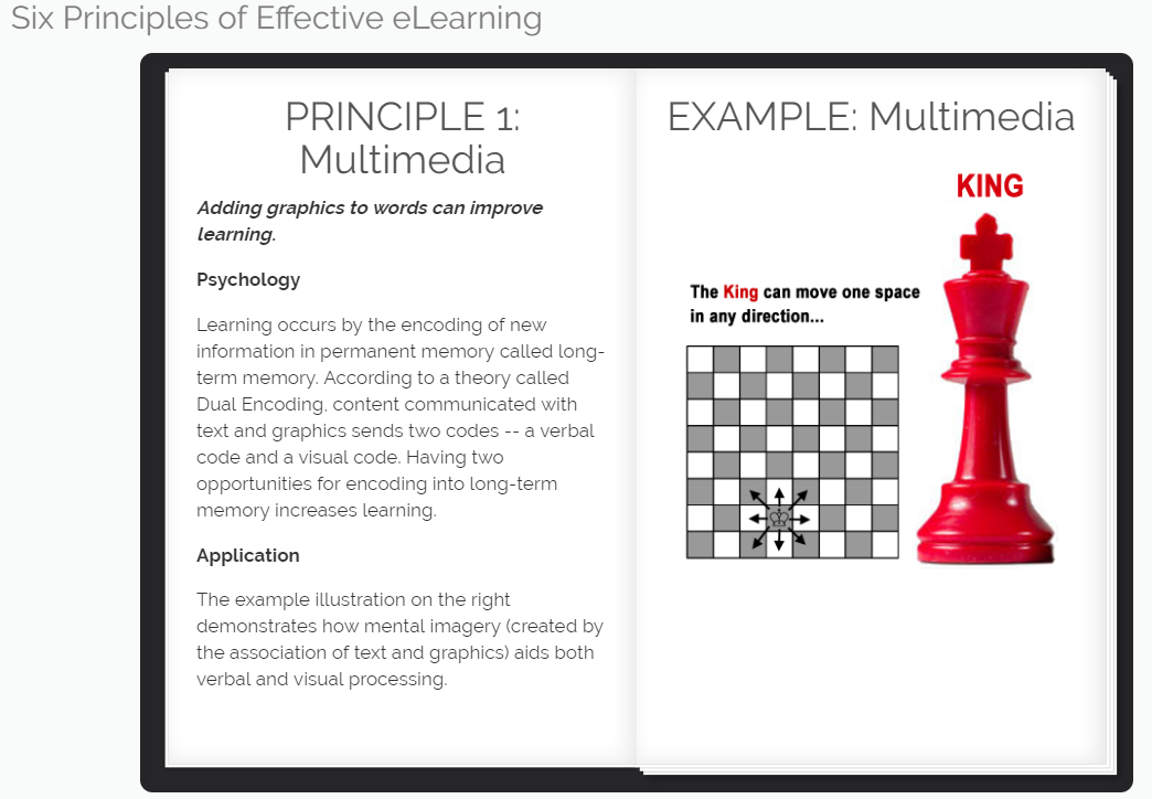
Responsive design for Flip Book means...
for smaller screens, the Flip Book changes...
from the two-page width....
to a single-page width.
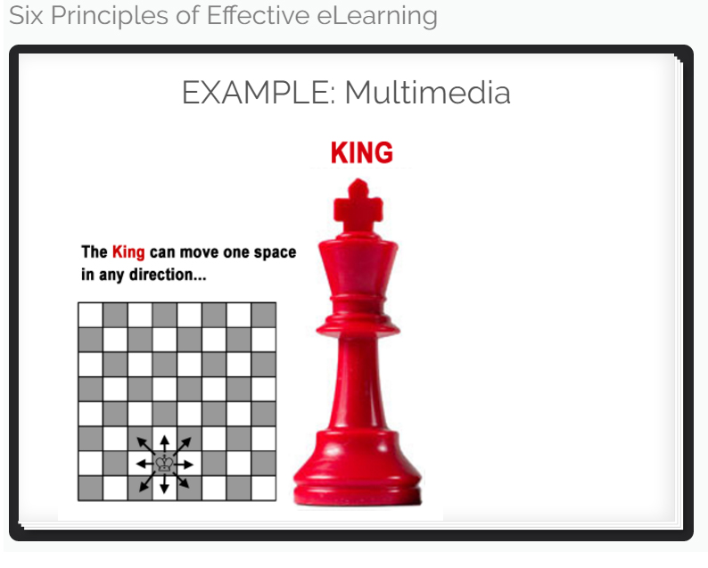
Learners still click to the right and left of the pages
to navigate forward and backward in the Flip Book.
